 Optimize Press is a WordPress theme that I have used on several sites. Do I recommend that you use it as well? It depends…
Don’t you hate it when the answer is “it depends”? I know, but this is one of those decisions that requires more information. Optimize Press is not a one-size-fits-all theme. It has a very special purpose. So let’s look at when you would want to use it and when you would not want to use it.
When You Would Not Want to Use Optimize Press
If you have a traditional blog, then you don’t want to use Optimize Press. The blog part of this theme is the weakest part of it. It doesn’t have a great blog look like Studio Press themes. I think even the Twenty Eleven theme that comes with WordPress looks better. For one thing, the blog sidebar is more narrow than traditional blog themes. You can make it wider but not easily and you have to understand CSS to do it.
When You Absolutely Should Use Optimize Press
There are two really fantastic features of Optimize Press. The first is the membership site template set. So if you are building a membership site with plugins like Digital Access Pass for example, Optimize Press is a must for the members’ area. It makes the member’s experience so much better than just using a regular theme.
There are many templates that fit hand in glove with the most popular membership scripts; home pages, login and logout pages; error pages; module pages and content pages. If you just assign the proper template to each page of your members’ area, the whole site just works fantastic.
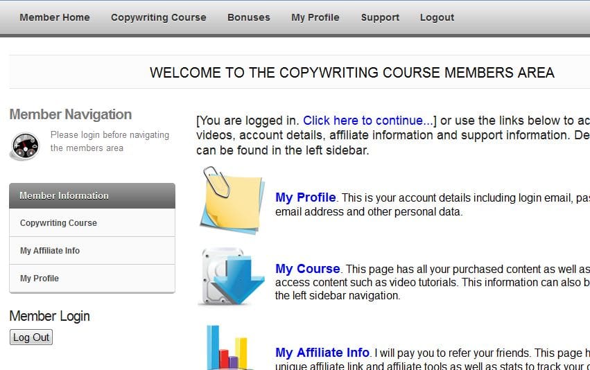
I’ve taken a screenshot of the members’ area for Karon Thackston’s Step-by-Step Copywriting Course. Click on the image to enlarge it. The navigation at the top is customizable because Optimize Press utilizes the WordPress custom menu system. The navigation in the left sidebar is created by Optimize Press based on the template selection.
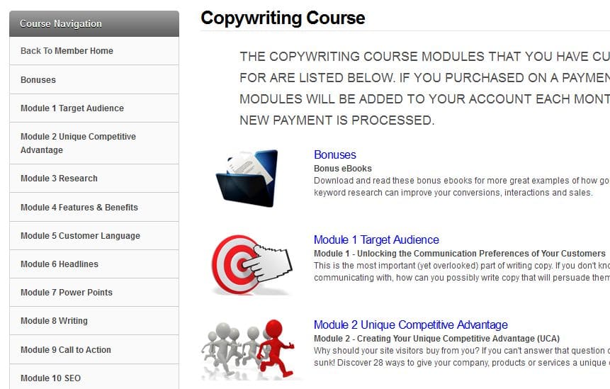
The module templates are used for your topics or courses. Then the actual content goes on content pages. When module pages are displayed, they bring in excerpts from the content pages. Think of them like a table of contents. Look at the screenshot of Karon’s module page below. You can see the various lessons both in the left navigation and on the module page itself. This makes it extremely easy for a member to find their content.
My suggestion if you are thinking of creating a membership site on your existing blog or website, is to install WordPress on another directory (like /members) and use Optimize Press as the theme for that installation. That way you can keep your existing website or blog without changing the theme.
Squeeze Pages & Sales Pages — Another Good Feature
One of the main reasons Optimize Press was designed is to create a product launch and with that comes templates for squeeze pages and sales pages including some for including videos. If you’ve been around the Internet for a little while, no doubt you have seen their cool opt-in forms. All you have to do is select which form you want, drop in your autoresponder code and the words you want to appear on the form. You then select your template, add your video embed code (if you are including a video), and include your benefits and call to action. The theme takes care of making it look like a professional designer did it.
Check out the screenshot below of this home page. This page does double duty as a home page and a squeeze page. Even Optimize Press includes some social sharing buttons as an option.
Bottom Line:
If you have a traditional blog, go with a traditional blog theme like a Genesis child theme, but if you want to create a membership site or need quality sales and squeeze pages, you can’t go wrong with Optimize Press. I use it on all my membership sites.
If you want to build a membership site, but just don’t know where to start or how to configure the software, take a look at “Deliver Digital Coaching – The Secret to Delivering Your Expertise to Thousands“. I show you step by step how to build a membership site from scratch.


