When designing a website whether it is a blog, ecommerce store, membership site, etc. you must tweak the final design for smaller browsers like tablets and phones. Why? You are going to find out that more than half of your visitors are on a mobile device and you want them to have as good an experience as possible. Avada theme responsive settings will make this easier.
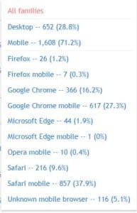
The image shows the breakdown of browser/device use of one of my websites for a period of 28 days. Mobile was over 70%!
I like to totally design a website for desktop first. Then I start tweaking it for phones and tablets. One of the reasons I like working with the Avada theme is that they now have several ways to make that tweaking easier. Let’s look at a few.
Breakpoints
What is a breakpoint? It is simply the size of a browser at which the mobile/tablet layout changes. Avada has several responsive breakpoint settings as shown in the image below.
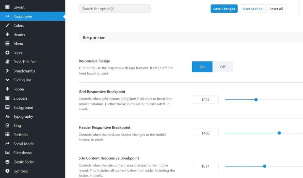
You’ll find these settings under Avada > Options > Responsive. First you want to make sure that Responsive Design is turned on. In the example, the breakpoint for grid layouts like blog posts is 1024. That means that browser sizes under 1024 pixels will “break” into fewer columns to avoid the content being too small to read.
Mobile Menus
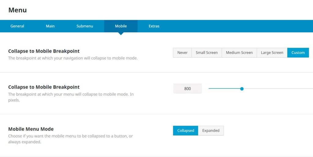
Menus can be controlled independently from other responsive settings. You must decide at what size browser your navigation menu becomes a “mobile menu” where the items are no longer shown horizontally. Rather there is an icon (normally the 3 bars — hamburger icon) that the visitor will click to open up a vertical menu. If you only have a few items in your menu, you may want to show the full menu to tablet users and only convert when the words start to wrap to a second line.
Avada has a Mobile Menu option in the Menu element as shown below. You can use a “custom” breakpoint if the default sizes aren’t exactly right for you.
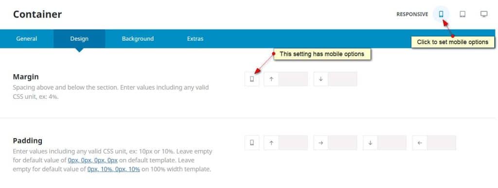
Avada Theme Responsive Tweaking of Containers and Columns
Sometimes the layout like padding and margins in your desktop design doesn’t look quite right on mobile. Since version 7, Avada is now including the ability to use up to 3 sets of numbers/sizes for certain elements. Below is a screenshot of what this looks like in the backend. Below the image is a video showing how it works.
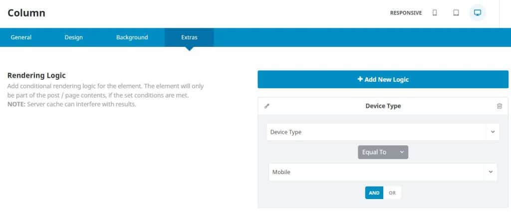
Duplicate Content Layouts for Mobile
What if you want a different layout for mobile than desktop of a certain section or sections? You can put the elements in their own container, designate the device as desktop and then duplicate the container, make the changes and then designate the device as mobile. See the screenshot below which shows where to set that up under “Extras” in the Container or Column settings.